Examining nanopore flow cell performance with pictures
16 June 2017
Tweet
My lab are just starting a nanopore genome project, and so we’ve been spending a lot of time playing data-scientist and trying to understand as much as we can about how the nanopore flow cells work, and what information we can get about our flow cell performance that might help us optimise our extractions and library preps. (The details of that are for another time, but let’s just say that we work on eucalypts, and they are tough and FULL of secondary metabolites).
I thought I’d share a few things we’ve been doing, in the hopes of perhaps getting some feedback, but also making sure others don’t have to reinvent the wheel.
For this post, I’m going to focus solely on things you can do with the super-useful sequencing_summary.txt file that albacore spits out when you basecall. This file is a tab-delimited file that allows you to see what each channel in the flow cell was doing throughout a run, and so provides a good starting point for examining and optimising performance.
All the R code for making the plots here is (in very rough form) here: https://github.com/roblanf/minion_qc/blob/master/plots.R
Probably the first thing you want to know is HOW DID YOU GO? This is pretty trivial to calculate from the file - there’s a summary.stats() function in my R code above. Our stats for this flowcell are:
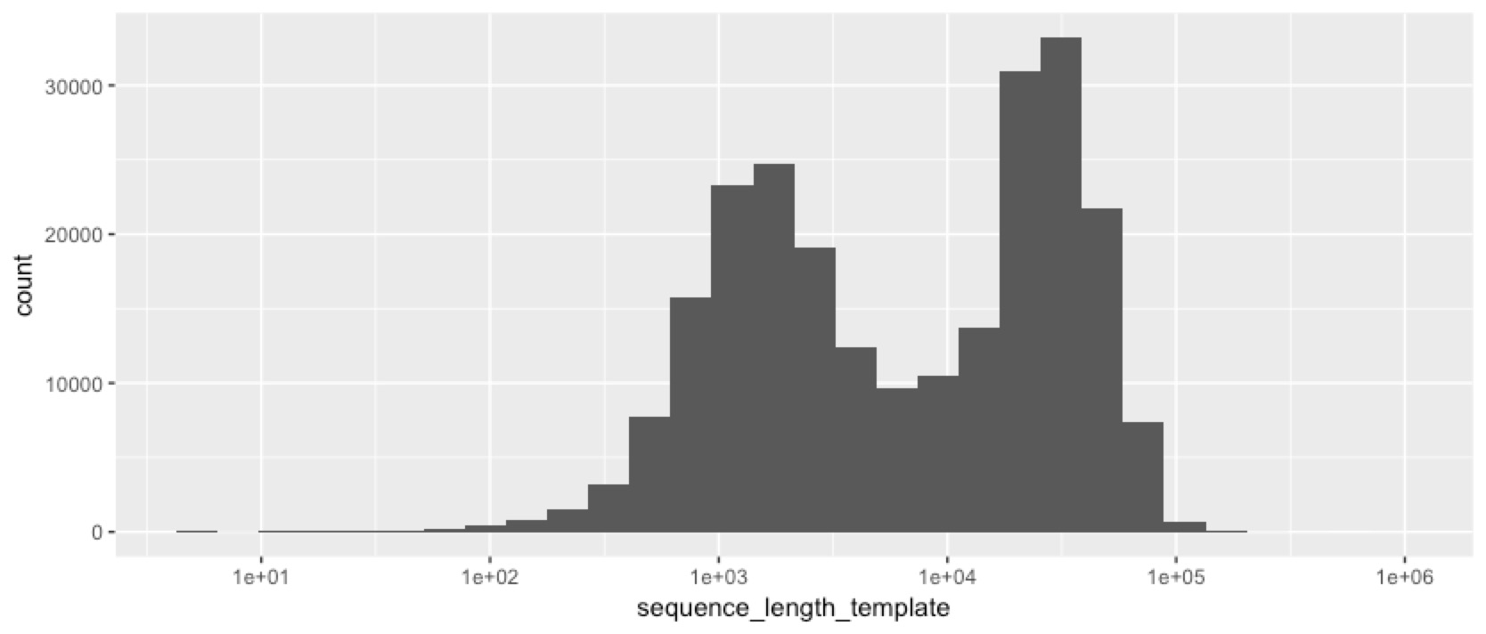
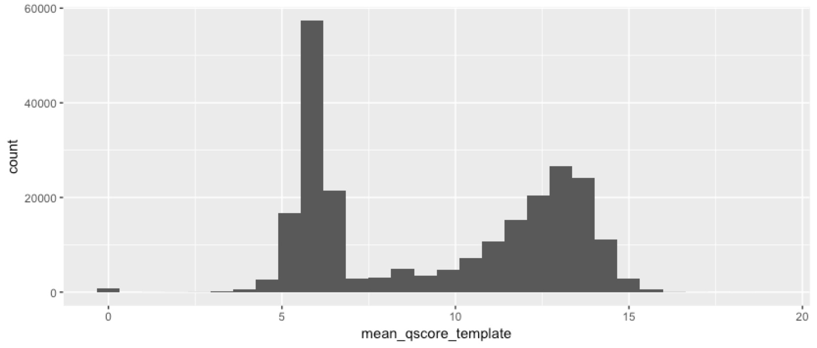
We’ve obviously got something interesting happening here. Despite size selecting the fragments, we still got a lot of short reads, and a lot of low quality reads. So next we checked whether the short reads are also the low-quality ones...
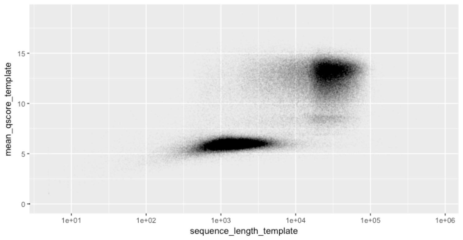
... and they are.
Of course, if this was our only flow cell, we’d probably just ditch those short low quality reads and go on with our lives. But since we’re planning on doing lots more flow cells, we wanted to know how much more we could figure out about what was happening.
One useful piece of information in the sequencing_summary.txt file is the number of events per template. An ‘event’ is just what MinKnow thinks is a change in the voltage across the pore, and my (shaky) understanding is that when everything is working great, we expect ~1.8 events to correspond to 1 base in the sequence. So we thought we could look at the number of events per base for clues about what might be happening here. The distribution of events per base is informative...
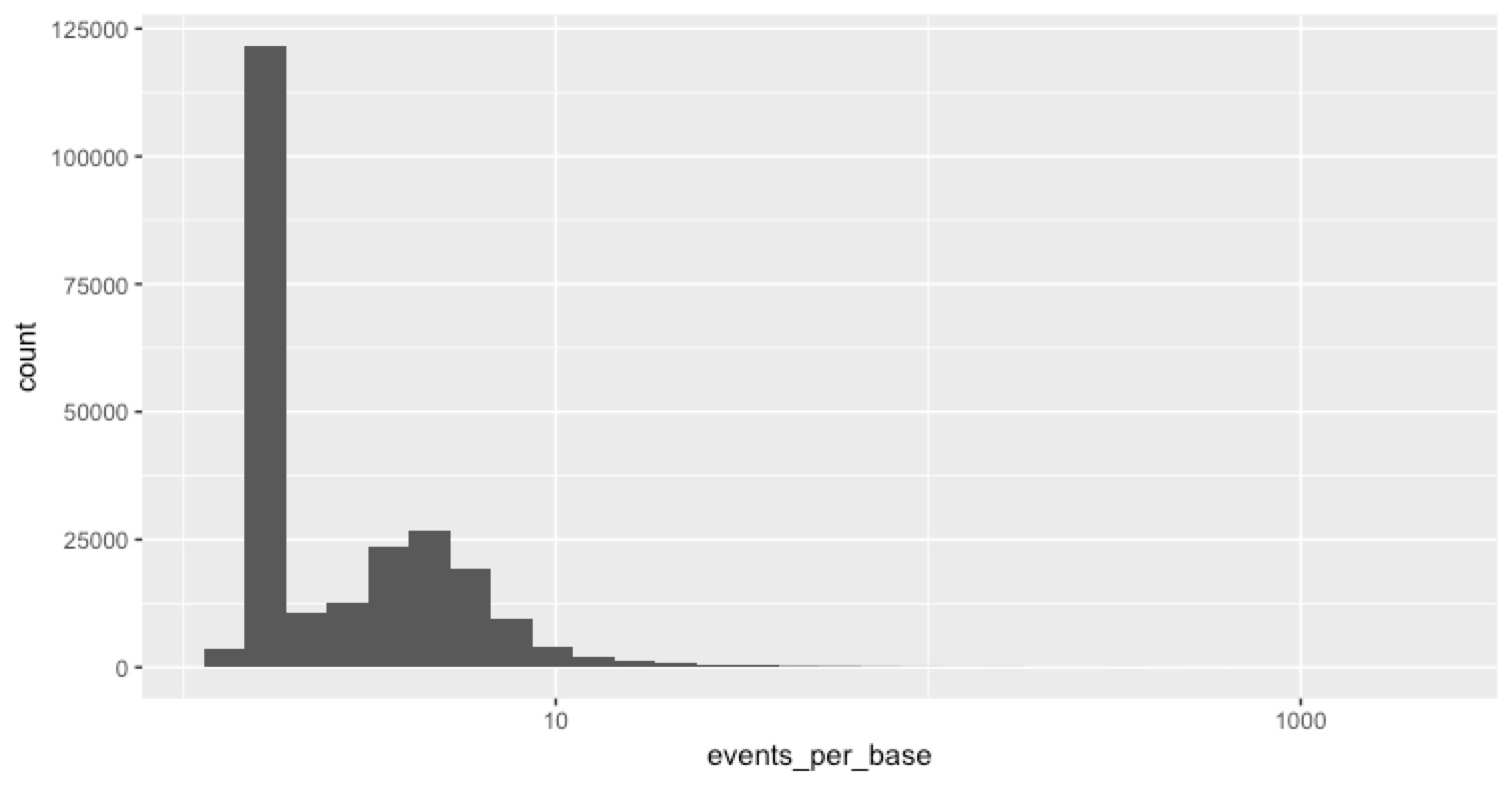
most reads worked fine (that’s the big peak) then there’s this log-normal looking distribution of events per base on top of that. Some of them are pretty high. For clarity in the next plot, I rescaled all events per base >10 to be 10. Then we can look at the scatter plot above, but colour the points by events per base to see which reads were the ones with a lot of events per base
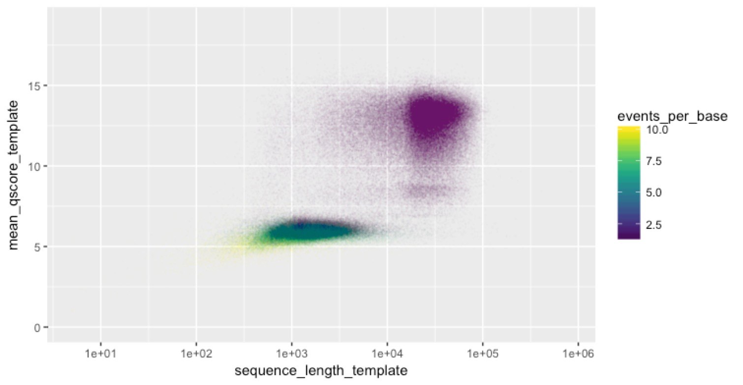
Hah! Now we see something. ALL of the reads with a lot of events per base are the short ones. We don’t know what’s causing this (share your ideas below if you think you do!), but here’s what we think could be happening: some fragments are getting stuck in the pores and are just stalled there. We think this could explain the lengths and the events per base. We think it could explain the events per base because a stalled read could create a lot of events, but Albacore might recognise by the repetitive nature of the events that the read is stalled, so call fewer bases (this is a total guess of course). We think it could explain the lengths if MinKnow figures out that some reads are stalled, and spits them out (e.g. by reversing the current on the pore). If we’re right, this would provide a convenient explanation for our bimodal read-length distribution, which is hard to explain otherwise because any shearing of the DNA should produce more exponential than bimodal distributions.
The neat thing about this is that it gives us some hypotheses to explore for optimisation, specifically:
Since we now know that we have a heap of these problematic reads, we wanted to know when they were appearing, and whether the problems were physically or temporally clustered on the flow cell. That might give us more clues as to the cause. We want to plot what’s happening on each channel so that we can see these short, low quality, high events-per-base reads. The channel information is right there in the sequencing_summary.txt file, so it’s easy to plot out a single channel. This time the Y axis is events per base (not rescaled to max 10, and on a log scale), the X axis is time into the run, and the colour is the mean Q score for the read.
Here’s our best channel, that seemed to perform pretty well:
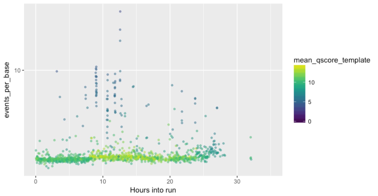
You can see a good strong stripe of high-quality (green) and low events-per-base reads for the duration of the run, with a smattering of the bad stuff over the top.
But here’s a much more typical channel:
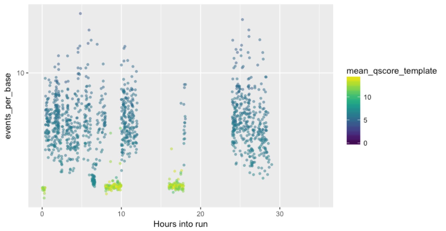
You can see in this case that the bad reads completely block the channel, and do it repeatedly until they appear to eventually kill it alltogether.
We can take a broad view (kinda hard to see, but still) and look at this across all 512 channels on the flow cell, organised according to their physical locations:
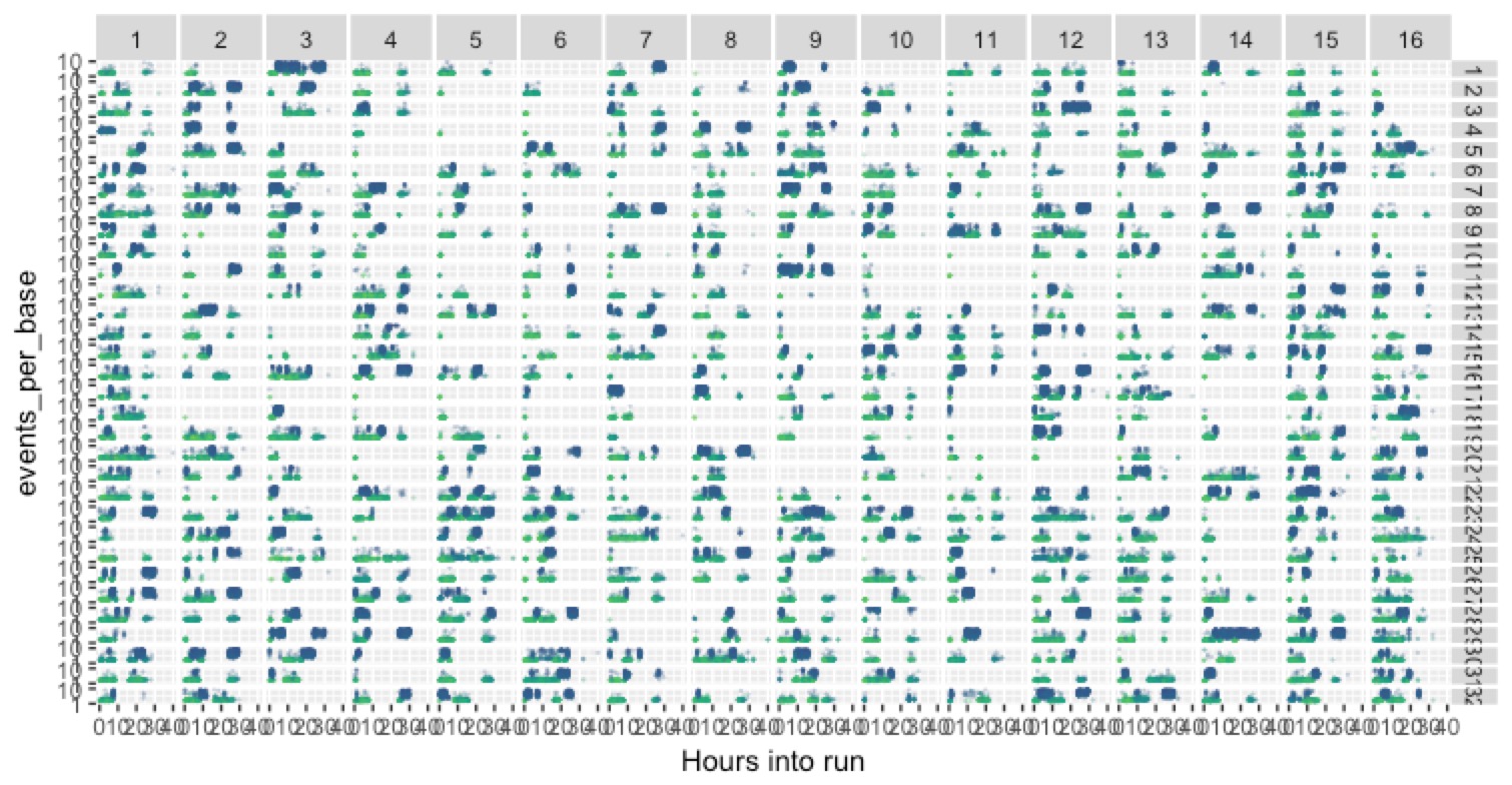
There’s a lot going on there, but the take-home is that there’s a huge amount of variance across the channels, and so we have a lot of potential for more optimisation to make improvements.
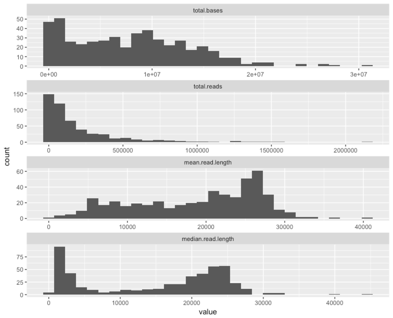
Given the previous plot, I wanted a summary of how the channels on a flow cell performed, so here’s one that summarises lots of potentially useful information in a single plot.
To me, this just further underscores the potential for us to optimise. We had huge variance in the performance of the channels, and a modest reduction in variance could take us from a good flow cell (3.8GB isn’t bad!) to a great one (>>10GB is the aim).
If you have any thoughts or ideas, please share them below! This post comes from lots of discussion and work withs Benjamin Schwessinger (who’s an independent research fellow at ANU and a total Nanopore legend), and lots of my lab members but most importantly Miriam Schalamun (now known as Magic Miriam for her lab skills) and David Kainer (bioinformatics whizz). The mistakes are all mine though!
My lab are just starting a nanopore genome project, and so we’ve been spending a lot of time playing data-scientist and trying to understand as much as we can about how the nanopore flow cells work, and what information we can get about our flow cell performance that might help us optimise our extractions and library preps. (The details of that are for another time, but let’s just say that we work on eucalypts, and they are tough and FULL of secondary metabolites).
I thought I’d share a few things we’ve been doing, in the hopes of perhaps getting some feedback, but also making sure others don’t have to reinvent the wheel.
For this post, I’m going to focus solely on things you can do with the super-useful sequencing_summary.txt file that albacore spits out when you basecall. This file is a tab-delimited file that allows you to see what each channel in the flow cell was doing throughout a run, and so provides a good starting point for examining and optimising performance.
All the R code for making the plots here is (in very rough form) here: https://github.com/roblanf/minion_qc/blob/master/plots.R
Summary stats
Probably the first thing you want to know is HOW DID YOU GO? This is pretty trivial to calculate from the file - there’s a summary.stats() function in my R code above. Our stats for this flowcell are:
- 3.8GB total data
- N50: 34354
- mean read length: 16150
- mean quality score: 9.5
- 14651 reads >50kb
- 1 read >500kb (it was ~860kb)
We’ve obviously got something interesting happening here. Despite size selecting the fragments, we still got a lot of short reads, and a lot of low quality reads. So next we checked whether the short reads are also the low-quality ones...
... and they are.
Of course, if this was our only flow cell, we’d probably just ditch those short low quality reads and go on with our lives. But since we’re planning on doing lots more flow cells, we wanted to know how much more we could figure out about what was happening.
Digging deeper
One useful piece of information in the sequencing_summary.txt file is the number of events per template. An ‘event’ is just what MinKnow thinks is a change in the voltage across the pore, and my (shaky) understanding is that when everything is working great, we expect ~1.8 events to correspond to 1 base in the sequence. So we thought we could look at the number of events per base for clues about what might be happening here. The distribution of events per base is informative...
most reads worked fine (that’s the big peak) then there’s this log-normal looking distribution of events per base on top of that. Some of them are pretty high. For clarity in the next plot, I rescaled all events per base >10 to be 10. Then we can look at the scatter plot above, but colour the points by events per base to see which reads were the ones with a lot of events per base
Hah! Now we see something. ALL of the reads with a lot of events per base are the short ones. We don’t know what’s causing this (share your ideas below if you think you do!), but here’s what we think could be happening: some fragments are getting stuck in the pores and are just stalled there. We think this could explain the lengths and the events per base. We think it could explain the events per base because a stalled read could create a lot of events, but Albacore might recognise by the repetitive nature of the events that the read is stalled, so call fewer bases (this is a total guess of course). We think it could explain the lengths if MinKnow figures out that some reads are stalled, and spits them out (e.g. by reversing the current on the pore). If we’re right, this would provide a convenient explanation for our bimodal read-length distribution, which is hard to explain otherwise because any shearing of the DNA should produce more exponential than bimodal distributions.
The neat thing about this is that it gives us some hypotheses to explore for optimisation, specifically:
- Residual salt is causing us trouble: so we should use less salt and/or add more cleanup steps
- We have some proteins blocking pores or interfering with DNA going through pores: so we should add another proteinase K step
- There are nicks in the DNA causing the blockages: so we can use FFPE to repair them before the library prep
Examining each channel’s performance
Since we now know that we have a heap of these problematic reads, we wanted to know when they were appearing, and whether the problems were physically or temporally clustered on the flow cell. That might give us more clues as to the cause. We want to plot what’s happening on each channel so that we can see these short, low quality, high events-per-base reads. The channel information is right there in the sequencing_summary.txt file, so it’s easy to plot out a single channel. This time the Y axis is events per base (not rescaled to max 10, and on a log scale), the X axis is time into the run, and the colour is the mean Q score for the read.
Here’s our best channel, that seemed to perform pretty well:
You can see a good strong stripe of high-quality (green) and low events-per-base reads for the duration of the run, with a smattering of the bad stuff over the top.
But here’s a much more typical channel:
You can see in this case that the bad reads completely block the channel, and do it repeatedly until they appear to eventually kill it alltogether.
We can take a broad view (kinda hard to see, but still) and look at this across all 512 channels on the flow cell, organised according to their physical locations:
There’s a lot going on there, but the take-home is that there’s a huge amount of variance across the channels, and so we have a lot of potential for more optimisation to make improvements.
Examining among-channel variance
Given the previous plot, I wanted a summary of how the channels on a flow cell performed, so here’s one that summarises lots of potentially useful information in a single plot.
To me, this just further underscores the potential for us to optimise. We had huge variance in the performance of the channels, and a modest reduction in variance could take us from a good flow cell (3.8GB isn’t bad!) to a great one (>>10GB is the aim).
If you have any thoughts or ideas, please share them below! This post comes from lots of discussion and work withs Benjamin Schwessinger (who’s an independent research fellow at ANU and a total Nanopore legend), and lots of my lab members but most importantly Miriam Schalamun (now known as Magic Miriam for her lab skills) and David Kainer (bioinformatics whizz). The mistakes are all mine though!